Free implementation guide / 08
Build a Landing Page Around One Clear Offer
Help the right visitor understand the offer, trust the evidence, and take one useful next step.
A page outline built around one offer and one next step.
A traffic source, intended customer and real deliverable.
Jump to the working checklist ↓
Aaron Peden
Founder & CMO · Practical business education
The outcome
Draft a complete landing page outline and a practical quality checklist before choosing page-building tools.
This playbook is general educational guidance. The worked example is hypothetical, not a claim about Aaron’s personal results.
01Match the page to the visitor’s intent
Write down what happened immediately before the visit. Someone searching for an urgent solution needs a different explanation from someone opening an introduction. Keep the headline consistent with the promise that brought the visitor.
Define one primary action: request an assessment, book a qualified conversation, or buy a clearly described product. Choose the action that fits the buying decision. Do not force a purchase before essential information is available.
02Explain the offer above the fold
A useful headline answers what the offer is and who it helps. Add a short explanation of the deliverable, relevant constraint and next step. Prefer “A five-page website for independent studios” to “Unlock your limitless potential.”
Use an action label that describes what happens. “See available appointment times” is clearer than “Submit.” If clicking does not actually reserve a slot, do not say it does. On mobile, keep the first action easy to find without hiding essential qualifiers.
SEE THE ACTUAL EXAMPLE
See what specificity changes
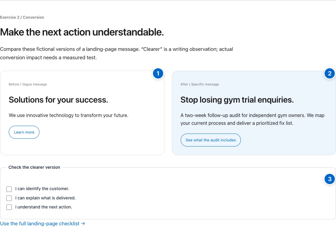
Your action: Ask a reader to identify your buyer, deliverable and next step without prompting.
03Replace persuasion gaps with evidence
Explain what is included, what is excluded, how delivery works and what the customer must provide. Address the most important objections near the decision point. Use a short process diagram only if it makes the sequence clearer.
Use real examples with permission. Distinguish your work from hypothetical demonstrations and third-party claims. If you have no testimonials yet, show the process, scope or a clearly labeled sample instead. Never invent a quote, logo wall or results badge.
04Make the action work for real people
Use labeled fields, visible keyboard focus and readable contrast. Ask only for information you need. Explain why sensitive information is requested. If you cannot deliver submissions to the right person, hide the form until the complete path works.
Test the success state and failure state. A form should not thank someone before the message is actually accepted. A purchase path needs accurate price and terms. Make the page usable on a small screen and when the visitor enlarges the text.
05Review the path, then measure it
Ask someone unfamiliar with the offer to explain what they get, what it costs or how pricing is determined, and what happens next. Watch where they hesitate. Their confusion is more actionable than a preference for a different button color.
Track qualified outcomes rather than raw clicks alone. Keep a record of the version and the change you test. Small samples can mislead; do not declare a winning page from a handful of visits. Review page speed and broken links before buying more traffic.
Worked example — hypothetical
A hypothetical studio website service changes “We build brands that inspire” to “A clear five-page website for your independent studio.” It explains page scope, owner-supplied content and revision limits, then offers “Request a fit assessment.” The sample design is labeled as a demonstration. This is an example of clearer communication, not a claim that the page will achieve a particular conversion lift.
Download the printable worksheet ↓
The worksheet opens in a browser and can be printed or saved as PDF. No email address is required.
Common mistakes
- Sending every audience to the same generic homepage.
- Using unverified testimonials to fill an empty evidence section.
- Adding multiple competing primary buttons.
- Testing visual preferences while the submission path is broken.
Your next action
Write the page outline in a document. Test whether a reader can explain the offer before you spend time choosing a theme.
- 01Visitor question
Match the intent that brought them here.
- 02Specific promise
Name the customer, deliverable and boundaries.
- 03Relevant evidence
Use only proof you can substantiate.
- 04One next action
Explain what happens after the click.
BUILD AN OUTPUT / ORIGINAL WORKSHEET
Turn a vague idea into a testable offer.
Write one clear sentence for each field. This builds a draft to test with customers; it does not score or validate demand for you.
Your answers stay in this browser. Nothing is submitted to a server or saved after leaving.
Make the idea concrete.
For an audit service, the page states who the audit is for, the deliverable, the scope and what follows the request. Its primary action is “Request an audit.” Relevant proof supports the stated offer. This is an illustrative offer, not a service sold on this site.
Done means verified.
Check each item as you verify it. Progress stays in this page; download your checklist before leaving.